July 2024 Market Outlook

The harder they come, the harder they fall - Jimmy Cliff
Newton’s laws of inertia have, in various forms, been applied to Statistics, Finance and Economics. Famously, he proved mathematically that “a body in motion tends to stay in motion”. Algorithms have been developed to illustrate that trends tend to continue to, well, trend. We recall the time-series algorithm sometimes referred to as the “JP Morgan Model” which described the tendency of market volatility to beget more market volatility.
Economist Claudia Sahm’s research illustrates a certain predictive property within the trend data of unemployment statistics. Back tested over many decades, this has become known as the “Sahm Rule” in economics—it was published in 2019 by the St Louis Fed. Having an economic axiom named after you at such a young age is an impressive feat (she graduated Denison University in 1998). Her talents have been employed at the Federal Reserve, the Whitehouse and Congress.
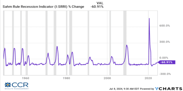
Without getting too bogged down, the Sahm Rule has a remarkable track record of predicting recessions going back to 1949. It states that when the three-month moving average of the unemployment rate rises above the minimum (lowest unemployment reading) of the past 12 months by 0.50% or more, the rule is triggered: a recession is imminent. This inertial tendency is illustrated in the nearby graph, where recessions are depicted with gray bars.
June’s unemployment rate released on July 5th showed reasonably solid jobs added to the economy (206,000), though revisions to the May and April jobs reports brought those down by a cumulative 111,000 jobs. More to the point, however, is that the unemployment rate ticked up to 4.10%. Currently, the Sahm Rule change in the 3-month moving average versus the 12 month low is at 0.43%. As Bespoke Investment Group points out recently, “there have been 12 prior instances when the Sahm Rule reached that level. In 11 of them, it continued on above 0.50% and signaled a recession”. A body in motion tends to stay in motion.
Concurrent with the rising unemployment numbers, we have seen a continuation of declining wage growth, with June’s average hourly earnings growth of 3.9%, the smallest gain since 2021.
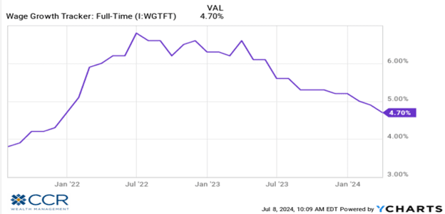
Whether we focus on wage growth or the unemployment rate, both indicators—along with the last two months of benign pricing data—indicate that the disinflation trend which was temporarily halted in the first quarter of this year seems to have resumed.
We won’t get into whether we expect an imminent recession. Rock-solid rules have a tendency to eventually succumb to exceptions. After all, the yield curve inverted almost exactly two years ago (July 5, 2022). Inverted yield curves were said to be reliable harbingers of recessions as well. The fiscal distortions of COVID and post-COVID “rescue plans” have turned more than one rule-of-thumb on its head.
We do not get initial Q2 GDP numbers until July 25th (at which time we will also get revised GDP from prior quarters), but given the data we do have, it seems expectations of GDP cooling would be justified. We know the Fed is looking at unemployment (it is one of their two mandates), and we know they are considering the Sahm Rule (the work was published within the Fed as a working study). Recent Fed speeches have been peppered with hawkish caveats given the spate of hot pricing data in the first quarter. These speeches are a Fed tool in lieu of actual policy changes. While there is an FOMC meeting later this month, we do not expect policy changes (rate cuts) until at least September. Rather, we expect to hear the rhetoric soften in speeches and Fed commentary, encouraging expectations of rate cuts by the markets before year’s end.
Rate cuts, of course, are generally thought of as good news for the markets. In the case of equities, we hope rate cuts offset a likely slowing GDP trend. In the case of bonds, however, rate cuts are a pure win. Keep in mind that there is a great deal of subjective “faith” in the outlooks for stocks. Many analysts can come to different conclusions about the future price of a stock (or the stock market) given the same input. Bonds, however, react mostly to math. Given the same input—most analysts will reach the same conclusion about the future price of bonds. The argument therefore is mostly about what the future inputs will be, reading the macroeconomic tea leaves. Our discussion above concludes that rate cuts are highly probable later this year, and thus the outlook for bonds is quite bullish (not withstanding possible frictions within areas of the credit markets due to slowing economic metrics).
Cash investors should not be complacent. We touched on this in our January Outlook, but we raise it again with more urgency as the probability of rate cuts has risen considerably. In short, money market, CD and T-Bill investors (we are not referring to savers with future liquidity requirements here) who have been enjoying 5%+ yields on these instruments for some time now will see these rates decline very soon, in our view.
Opportunity cost (the cost in terms of lower returns due to inaction) will give way to reinvestment risk (the risk that investors will not be able to reinvest cashflows at an equal or higher rate than the current rate). Know that as you watch rates decline on money markets, CDs and T-Bills, actual bond prices are rising concurrently.
As already mentioned, bonds are rather simple investment vehicles because the returns are mostly governed by math, rather than the great deal of sentiment that goes into equity values. In fact, there is a 94% correlation between the current yield on bonds and their 5-year forward total returns. This is illustrated below, along with the current yields on certain sectors of the bond market (note the yields in the chart are 12/31/2024 but are little changed since then).
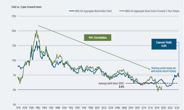
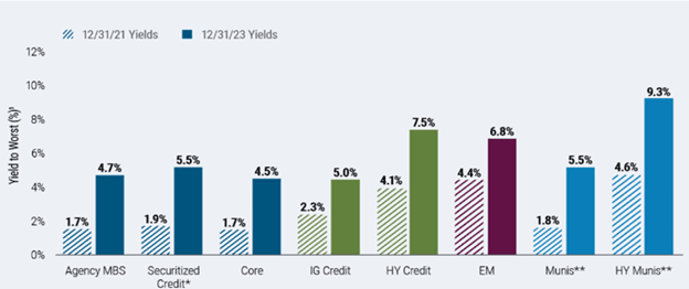
The message here is simple and is geared towards investors using cash instrument allocations specifically because of their yields. Economic data points to a high likelihood of rate cuts in the near future. For investors looking to maintain or improve on the returns they have received from cash instruments, there is some urgency to begin repositioning into bonds. Waiting until actual lower yields in cash are realized, and the move into bonds will come with reinvestment risk and opportunity cost.
Checking in on equity markets, we wrote about a sigh of relief we were feeling early this year as it appeared the stock market rally was broadening out (beyond the Magnificent Seven). Well, as they say, “not so fast, Mister”.
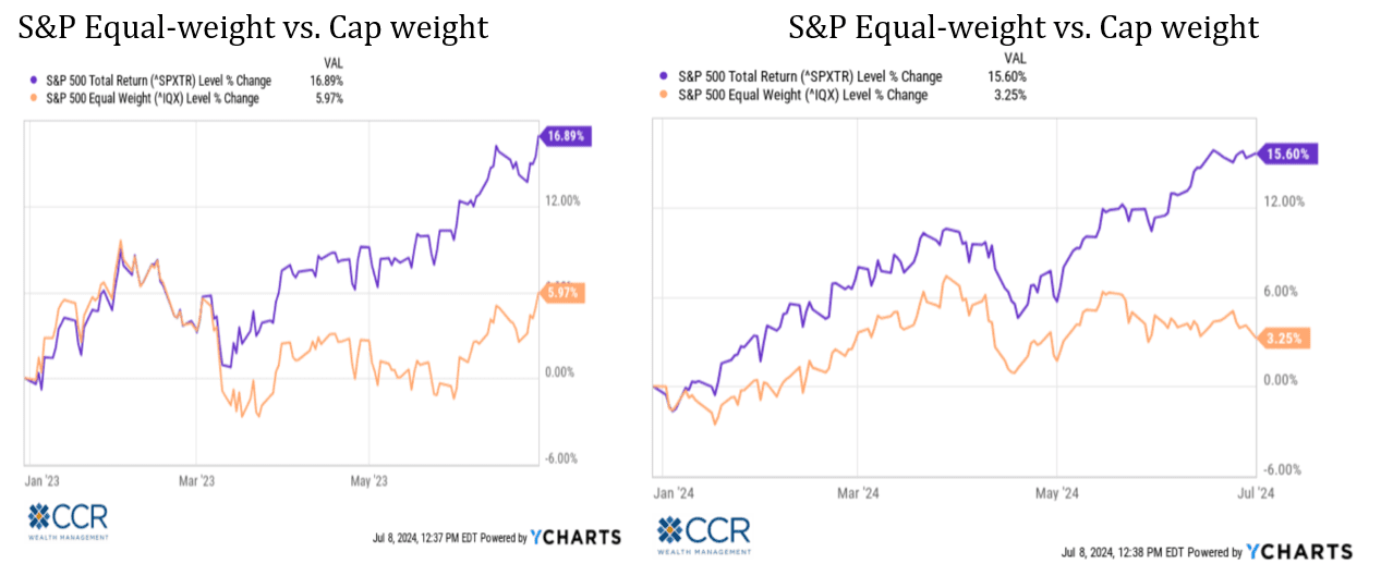
We lamented last year’s return differential between large-cap stocks and small-caps, as well as the difference between “growth” and “value”. Even the spread between the Equal Weight S&P 500 and the Cap-Weighted S&P 500 was stark a year ago. In our update, we see the broadening of market participation early this year was brief, and that in some cases—the return differentials are even greater now than they were last year. Below we compare these differentials on a year-to-date basis today versus last year.
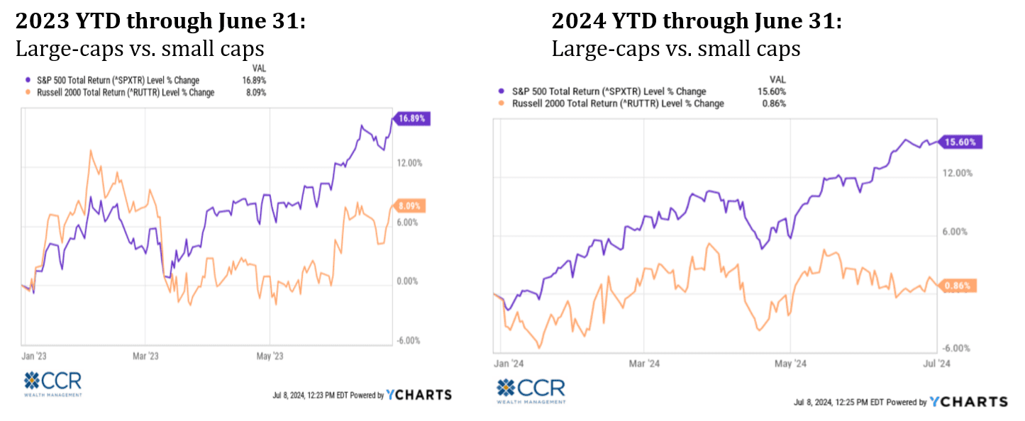
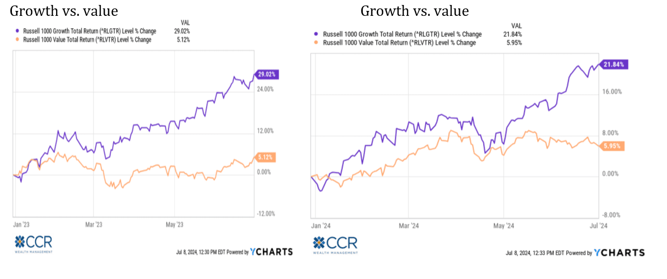
We realize some may not know the significance of how an equity index is constructed. There are three basic methodologies: Price Weighted, Market Cap Weighted, and Equal Weighted. The first, price-weighted, is a methodology that gives the higher priced stocks in an index proportionately more influence on that index. The Dow Jones Industrial Average is such an index. But price (in $ terms) per share is an arbitrary measure. If a stock splits 10:1 (as recently happened with the now-largest company in the world)—should it have 1/10th the influence on the index as it did the day before the split? This is a major reason why virtually no money managers benchmark themselves to the Dow and other price-weighted indexes.
Market-Cap Weighted indexes, on the other hand, assign index influence based on the size of the company (shares outstanding x price/share). This scheme is most commonly used as a benchmark because it has economic significance. The larger a company gets due to its economic growth, the more influence it has in our economy (purchasing power, taxes paid, employment, ect). The S&P and Russell indexes are most commonly quoted in their cap-weighted form.
Lastly, Equal-weight indexes simply assign each stock within the index an equal impact on the value of the index. This tends to give smaller companies within the index more influence than they would have in the market-cap weighting scheme. And as illustrated above (alongside the cap-weighted version) can show the significant influence a handful of very large companies has on our perception of how “the market” is fairing.
The same 500 stocks are up either 15.60%, or up 3.25%, depending on how you arrange the deck chairs. This wide disparity should give pause to investors who are “chasing the index” because they think it’s a fair representation of the underlying economy. In fact, they are chasing an ever-shrinking handful of stocks representative of only a portion of the economy.
This is an imbalance that reversion to the mean can be counted on to correct. The difficulty (as we have seen in the last two years), is that timing the reversion is all but impossible. Twenty-five or so years ago, infrastructure-builders of the internet dominated the growth (servers, fiber-optics, etc)—and the market-cap weighted indices. This time around it is again infrastructure-builders, but of “AI” (chips). We hope the glut of fiber-optics and servers that resulted toward the end of the ‘90’s doesn’t repeat. It could if investor expectations continue apace.
Last year the term “Magnificent Seven” was coined to describe a handful of stocks dominating the market—and by virtue of their size, pulling the S&P 500 index up significantly in return while the other 493 companies turned in a cumulatively less lustrous performance. Thus far this year, a single stock among this group accounts for 1/3 the ytd performance of the stock market. Is this healthy?
One last look at the current lack of breadth in this market shows that among the 12 GICS sectors that make up the S&P 500, all but two have negative relative strength versus the index. Even within the Communication Services and Technology sectors, relative strength is due to a very small group of names.
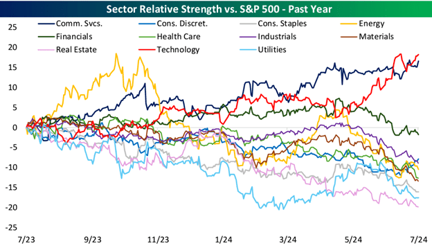
We point this out for perhaps the “umpteenth” time as long-term investors, among whom we count probably 98% of our clients, should have a basic understanding of what it means for “the market” to be up 15.60% in this age. It is not “the market”. It is 3-4 massive companies within the market-cap weighted index that are up anywhere between 30% to 160%.
Isaac Newton’s Law about trends tending to continue may seem at odds with the principle of mean reversion. Both axioms can co-exist. Algorithms that describe mean reversion include something called a “residual value”, or error term. It is the cumulative effect of this error term which leads to eventual reversal (and reversion towards the mean). As far as “bodies in motion” staying in motion: Newton’s Principia also mathematically described gravity. Many investors rediscovered gravity in 2000 and 2001.
“The harder they come, the harder they fall” sang a favorite artist of ours. We do not pretend to know when—or by how much “the fall” may occur. But we trust in reversion to the mean. As we laid out in January, our antidote is diversification. We believe this is a good time to discuss with your advisor your portfolio’s level of diversification as well as the available incremental steps out of cash which may be appropriate for some enamored of recent cash rates.
Follow us on social media for more timely content delivered directly to your news feed!
