October 2024 Market Outlook
A story of perdition and redemption, The Magnificent Seven (1960) is a classic romantic tale of murderous, craven greed on the one hand, and unlikely, heroic sacrifice on the other. Chris, Vin, Harry, Bernardo, Britt, Lee and Chico— grievously flawed heroes and mostly outlaws, band together to save a small village from the dastardly Calvera and his bandits. If you are of a certain age, you’ll recognize Yul Brynner, Steve McQueen, Charles Bronson and James Coburn among this motley band of brothers. Younger clients may recognize Denzel Washington, Chris Pratt and Ethan Hawke from the 2016 remake.
Either version is rollicking good entertainment in the traditional American Western genre. We love heroes and mourn the tragedy of their sacrifice.
The heroes of the US stock market could use a bit of your sympathy these days—some of them anyway. As you by now know, sometime in late 2022 the term “Magnificent Seven” was applied to the phenomenon of seven US large-cap companies whose positioning in the market and in the economy, was such that a narrative was launched, a story spun, and the casting call so perfect we could not help but be engrossed in the dramatic excitement of the millions being made. Mythmaking on a cinematic scale! Artificial Intelligence and the race to harness it was so compelling we left our wits at the door and saw to it that over 30% of every dollar ploughed into the S&P 500 index found its home nestled within these Magnificent Seven stocks, numerically less than 2% of the index itself. They could do no wrong. They were bullet proof. This is the way of the future! AI is here, is now, and will light the world on fire!
So we were told, anyway.
Putting a dramatic spin on recent history is therapeutic for those of us who have seen this movie before. We thought we were done brooding on The Seven, but here we are. We can’t ever quite tell you how it ends, or when it ends, but we know there’s an ending—or at least a transitioning. But we take great comfort in knowing that those who fanned the flames, rarely drawing parallels with past dramatic tragedies of nose-bleed valuations and monolithically bullish sentiment will do a thorough post-mortem and tell us, one day, how the fall was obviously inevitable from the beginning. “Nvidia is up 2,000% Since 2019. These WSJ Readers Invested Early” reads an August 23 headline. Surely even today, there are those whose heads have been firmly planted in the sand. Perhaps this article and its ilk will finally pry these latecomers from their blissful ignorance and into the light. Much the same way gushing headlines about Hertz’s 100,000 EV purchase in October 2021 put a final stake through the heart of any remaining skepticism about the valuation of a certain EV manufacturer and its genius wunderkind CEO. “Wave of the future” indeed, what are you waiting for? That stock crested two weeks later. Three years on it remains over 43% off that high. This vanguard of future-tech and a zero-carbon future, whose stock price soared as breathless hosanas bellowed forth from the media (social and financial) is a card-carrying member of the Mag. 7 (and this year is the only one of the seven in negative territory).
In the intervening years year-over-year inflation peaked out at 9.1%, the Fed recognized inflation wasn’t so “transitory”, and the yield on the 10-year Treasury went from 1.50% to 5.00%. Consumers lost nearly 20% of their purchasing power on a cumulative basis, and of course, ChatGPT became the new beacon of everything that tech would become. No reason to own anything else. Suddenly, everyone’s got an “AI angle”.
Of course, things do change. Gravity is real. And it turns out the appetite for EVs didn’t quite match the narrative. But for investors, timing the change is quite difficult. Often market transitions occur in hardly perceptible ways, right under our noses, because the drumbeat of narrative tells us every dip is a buying opportunity. Until we realize maybe the last one wasn’t. “Gambler’s Fallacy” is a behavioral tendency that recognizes mean reversal and tries to time the reversion. This is a notoriously fraught endeavor (hence the fallacy). But we believe there is reason to think transition may be afoot in the markets. Further on we will delve a bit into some simple technical analysis (staying out of the weeds) to illustrate our point. Before we do, however, it is clear to us that while transition may be happening “under the hood” of the broad equity markets, these markets remain firmly in bull-market status and in positive trends at this writing, and we see no evidence that that is at near-term risk.
The Magnificent Seven:
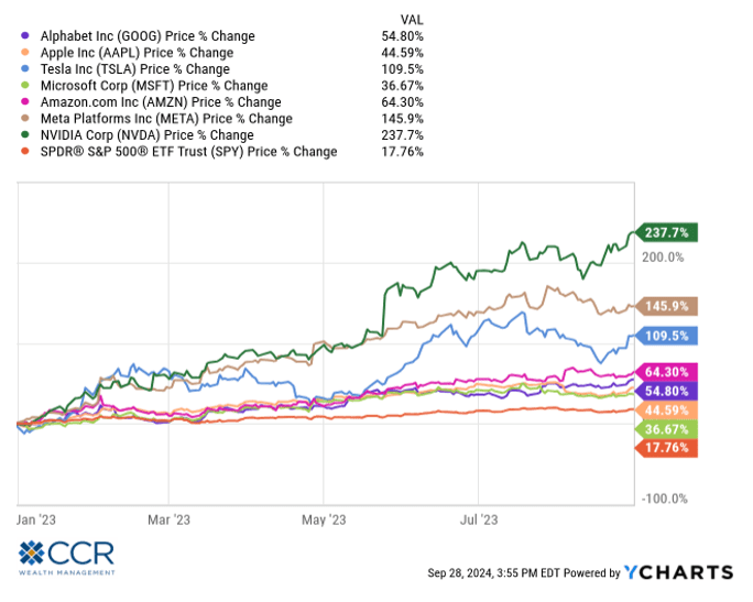
Below is a chart of the Mag 7 stocks plus the S&P 500, which is the orange line. This chart shows the first eight months of last year (2023). As we’ve written about extensively, these are the largest companies (by far) in the S&P 500 index, and as you no doubt recall, had a massive upward influence on the performance of the index for most of last year. As is plain, every one of these 7 outperformed the broader index, which is indicated by the orange line. Without the influence of the Seven, this period’s return for the index would have been closer to flat than up 17.76%.
Fast forward to 2024, year to date. Same chart:
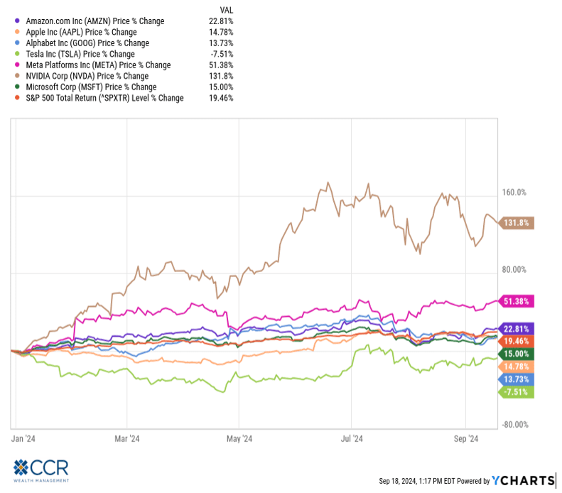
Alas, on a year-to-date basis 4 of these 7 stocks underperform the S&P 500, some by a significant amount. Therefore, it can be said that most of the Seven are acting as a drag on the index. Make no mistake, a year in which the S&P 500 is up over 21% through mid-October is a great year by any standard. Oddly enough, at the end of movie The Magnificent Seven, there were only three surviving heroes! Ok, maybe we’re reaching a bit here.
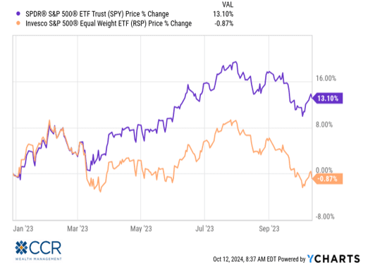
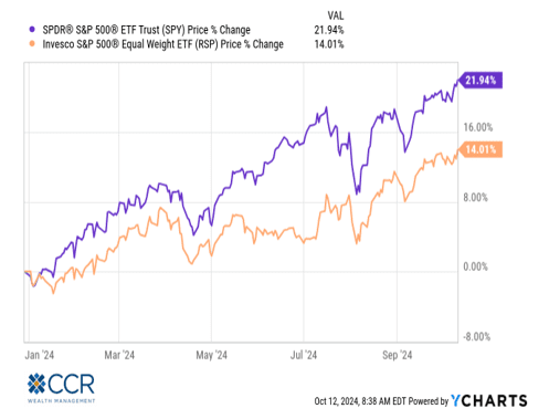
Further evidence of transition comes in the comparison of a “market cap weighted” S&P (purple) versus its “equal weighted” counterpart (orange), removing the outsized influence of super-sized companies:
Year-to-date 1 year ago:
The same chart year-to-date this year:
The same chart over the last three months (7/11/’24 thru 10/11/‘24):
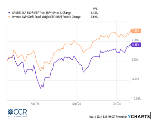
This is the most significant three-month outperformance of equal weight relative to cap-weighted S&P 500 we can recall since the fourth quarter of 2022. The question revolves around the staying power of this trend (early 2023 saw a similar chart—but it was fleeting).
Broad market indices like the S&P 500 or the Russell 1000 are often sliced and diced into various categories (like “value” and “growth”, “cyclical” and “defensive”, etc). In their market-cap-weighted form they are also designed to mimic economic reality by being segregated into sectors, like technology, financials, industrials, etc. There are 11 general sectors within the S&P 500 (which can be further disaggregated into industry groups (25), industries (74) and subindustries (163)). We will take a look at a few of these sectors below through the lens of “technical analysis” to see if they tell us anything about what’s going on under the hood of the S&P 500.
As promised, we will not get into the weeds of technical analysis, other than to give a brief description of the discipline and one of its most basic and widely used indicators, the trend. Unlike fundamental analysis, which concerns itself with the study of balance sheets, income statements, comparative valuations, macro-economic expectations and management’s guidance of a company’s strategy (all of which can be interpreted differently by different analysts, and all of which is subject to the influence of “narrative”), technical analysis considers only the stock price history in the context of “patterns”. Trading volume and put/call ratios can sometimes come into play, but we will stick with the basics here, price analysis. The premise of technical analysis is that patterns are recognizable and have a tendency to repeat. So, with technical analysis, a directional prediction can be made regarding a stock price (or a sector for that matter) without the noise of narrative and fundamental data.
One of many technical indicators is simply “trend analysis”. Trends tend to be viewed by technicians as persistent, meaning simply that they usually don’t change all that often. A stock (or sector) goes up and down every day and every week—but generally a positive trending stock/sector is largely expected to remain positive (an upward price trajectory), and a negative, bearish trend remains bearish for the foreseeable future. In this discipline, trend changes, either ex-post or anticipated, are where the actionable investment trades are made.
Perhaps the most common trend indicator used is the comparison of the longer 200-day moving average relative to a shorter 50-day moving average of a stock or sector’s price. In short, whether the shorter-term moving average is above the longer-term moving average (bullish), or below the longer-term moving average (bearish) informs a technician about the likely direction the stock/index will move, at least in the near term. A 50-day moving average crossing above the 200-day moving average (a “golden cross”) is viewed as a trend change from negative to positive. A “Bear Cross”, or “Dark Cross” is the opposite—the 50-day MA drops below the 200-day MA. By smoothing out the trends with moving averages, this method discounts short-term volatility which may otherwise give false signals.
The nearby chart is interesting to us for use as an example because it is also indicative of one of the phenomena occurring in today’s market. Behold, the S&P 500 Utilities index 1-year technical chart.
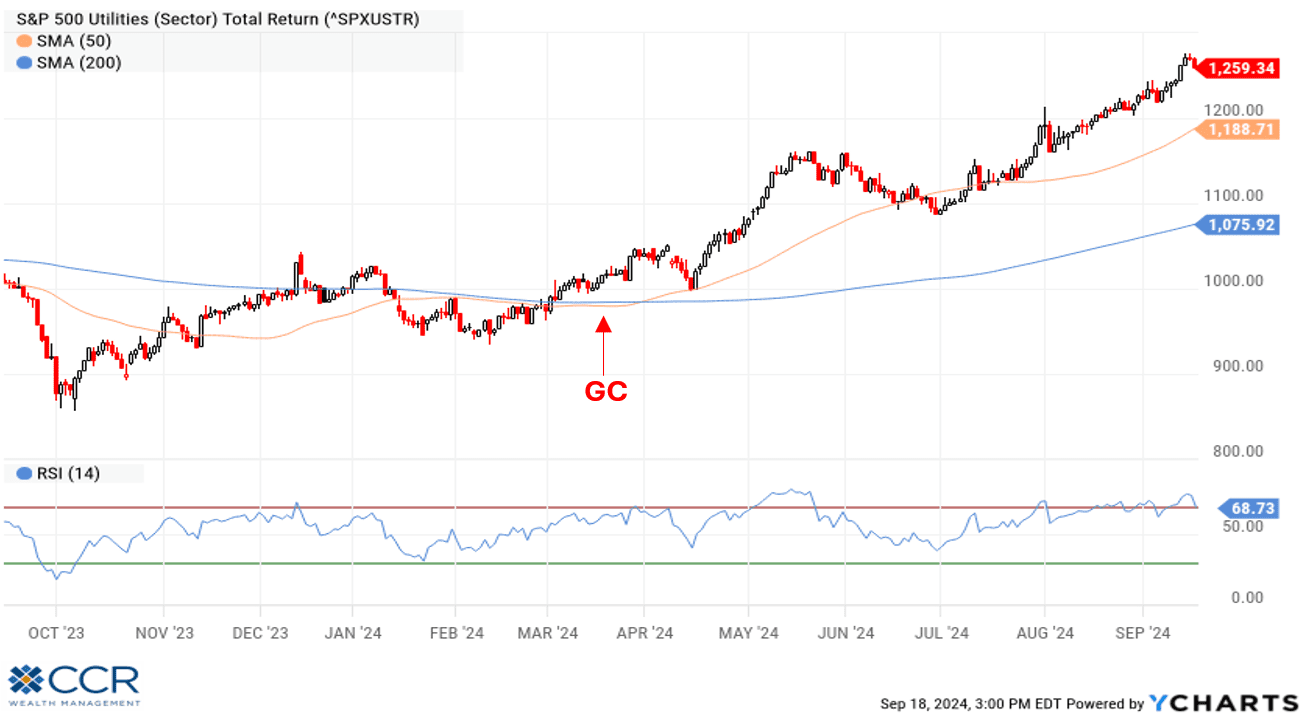
The actual index value is indicated in the black/red candlestick line, while the shorter-term moving average (50 days) is in orange, and the longer term moving average (200 days) is in blue. We see a “golden cross” (GC) positive trend change occurring back in the Spring with the 50 DMA crossing above the 200 DMA. While the index was doing decently off the bottom in 2023, this trend-change indicator would give a technician confidence that the direction of the index likely will persist. And persist it has—it may surprise some to learn that Utilities are the best performing sector in the market thus far this year, up over 28% at this writing!
Technical analysis aside, what else do we know about utilities? Utilities, as one of the 11 GICS sectors in the S&P 500, are one of the smallest sectors represented in this index (~2.65% of the index). Utilities have traditionally been viewed as a “defensive” sector. Investors have a long history of rotating into utility stocks when confronted with economic uncertainty—and they are usually outperformers during bear markets (the S&P 500 utility sector was up 1.57% in 2022 when the S&P 500 was down over 18%). After all, keeping the lights on is a priority for all consumers. Lastly, utility stocks are often viewed by investors as “bond proxies”. These highly regulated companies are generally highly leveraged, and pass on large portions of their earnings to investors in the form of dividends. These characteristics also make them highly interest rate sensitive (like bonds: they tend to do well when interest rates decline).
Next up: Real Estate. More specifically, Real Estate Investments Trusts (REITs) traded as stocks in the equity markets. REITs are also one of the GICS sectors in the S&P 500 and are also one of the smallest sectors (~2.45% of the index). REITs pass through most of their funds from operations to investors in the form of a dividend, and like Utilities, are highly leveraged. REITs have also traditionally been viewed as defensive investments because of their income profile, and the fact that they are backed by the “hard” assets of commercial real estate.
As you may have heard, commercial real estate has struggled through the COVID and post-COVID years—though to different degrees depending on the type of real estate. Office buildings were perhaps the worst hit due to reduced occupancy trends.
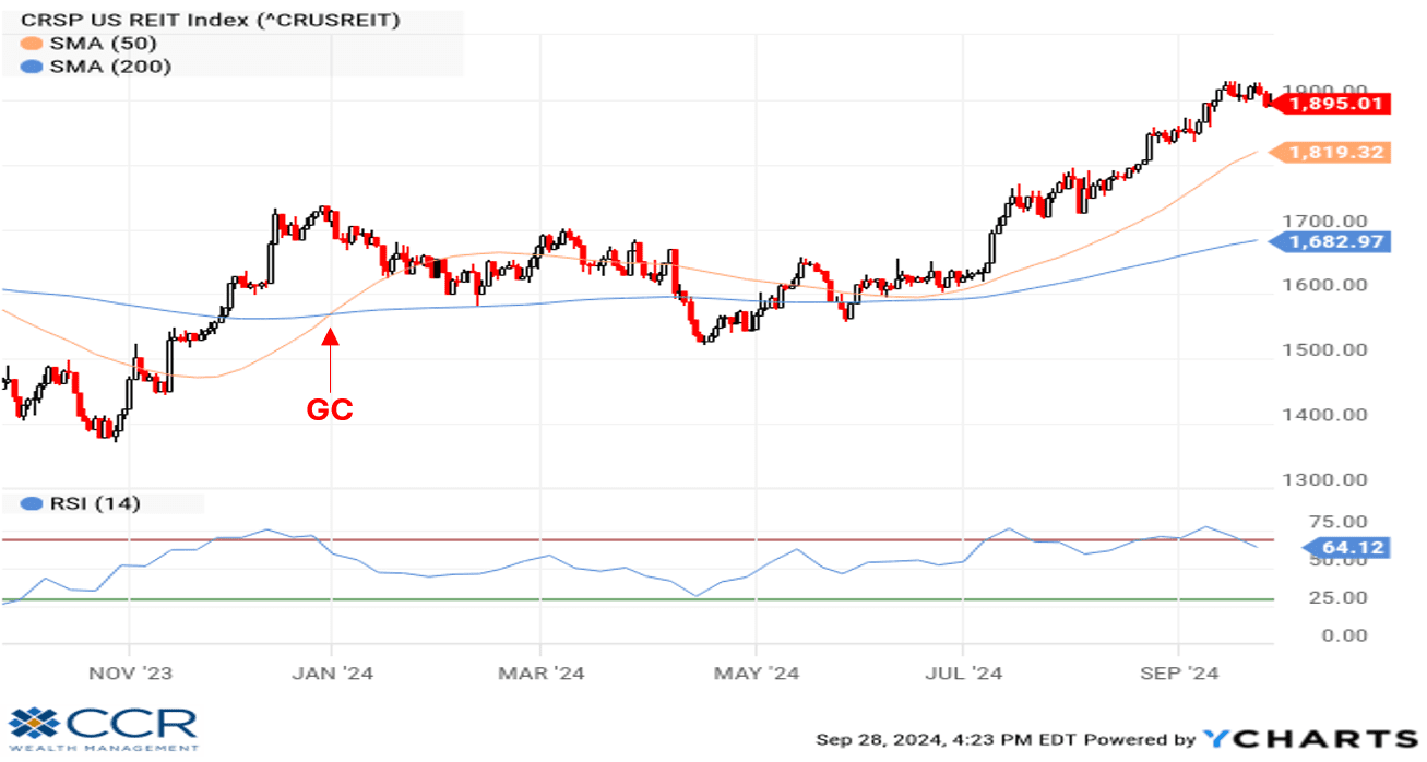
As most real estate is leveraged, the sharp rise in interest rates two years ago acted as a “double whammy” on the sector, further scaring away investors concerned about possible debt defaults and bankruptcies. But as the near-by technical chart depicts. The trend in the broad CRSP US REIT index turned from negative to positive back in January of this year. So even while this grouping moved sideways for most of the first half of 2024, a technician would continue to view the sector in a positive light. Sure enough, a significant breakout occurred in July, further separating the 50-day moving average above the 200-day.
One more “defensive” sector to consider is Consumer Staples. In times of economic uncertainty, people will generally continue to spend money on staples, which include everything from soap and toothpaste to cleaning items, groceries, soft drinks, alcohol and tobacco. Because this sector contains some comparatively “giant” companies alongside many more with a fraction of the market cap, it is most appropriate to look at an equal-weight version of this index (otherwise you’re really looking at a chart of Walmart).
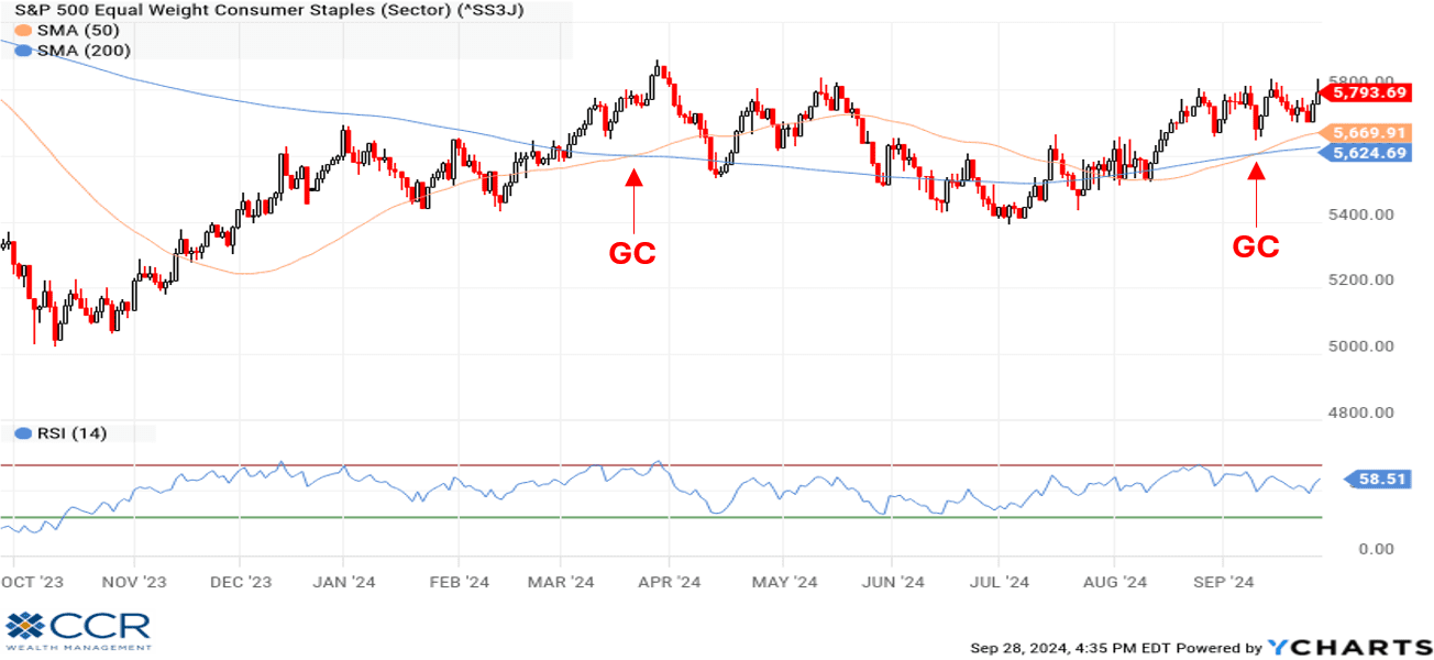
A “Golden Cross” in March failed briefly in late summer but has re-emerged recently and the trend is positive. Consumer Staples, also called Consumer Defensives, are retail companies which stand in contrast to their counterparts, Consumer Discretionary (or Cyclicals). As the name implies, Cyclicals are retail consumer stocks which benefit from the strong period of a normal economic cycle. Consumers spend more freely on restaurants, electric vehicles, luxury items, apparel and travel when they are confident with their job prospects and comfortable with their financial situation. Consumer Cyclicals also benefitted from the distortions of various (and massive) fiscal stimulus packages out of Washington in recent years by soaking up “relief” checks the government was sending to consumers—whether they needed them or not.
Consumer Staples, Utilities and REITs, defensive sectors all, handily outperformed the S&P 500 Information Technology index, the Philadelphia Semiconductor index, and the Consumer Discretionary (Cyclical) index in the third quarter. And as mentioned, Utilities are best performing sector in the S&P 500 on a year-to-date basis.
As we survey the charts of the Technology and Consumer Cyclical sectors, equal weight of course, we can confirm that both remain in positive trends—though with less distance between the 50 DMA and the 200 DMA than in recent quarters (and years). Moving averages do not change direction instantaneously, but one might imagine a “Bear Cross” in the future—though one should not be driven by imagination alone. While their trends remain positive, the momentum has clearly transitioned to more defensive areas of the market.
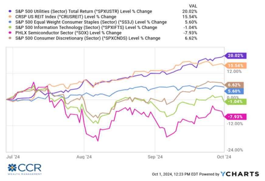
Technical analysis is interesting if you give credence to the notion that stock markets are thought to be “predictive” of future economic conditions, that they are “leading economic indicators”. If we hold to that school of thought, perhaps the breakouts of Utilities, Real Estate and Consumer Staples is telling us the economy is in for a slower pace of growth ahead than today’s stock valuations would otherwise imply. While cyclical sectors like technology remain in positive trends, many of the “heroes” of the latest bull cycle exhibit high-water marks (52-week stock price highs) that date back to June or July and have rallied from sell-offs only to top out at a series of lower highs since then.
Technical analysis allows you to shut out the often-contradictory narratives and gives you a tool to listen to what the markets are actually saying. While technical analysis has its fervent adherents it should not be a primary driver of investment decisions, in our view. The fundamentals of earnings and financial stability gleaned from income statements, cashflow statements and balance sheets should be. However, we recall an “old timer” early in our career describe the inclusion of technical analysis into fundamental decision making as the difference between two hands on the piano versus only one.
Economics and the Fed:
We got the rate cuts from the Fed we surmised would get back in our July Outlook. September’s rate cut of 50 basis points surprised no one, as the market unanimously expected a cut, and was evenly split between 25 basis points and 50. But what to make of the Chairman’s comments after the meeting?
He said, “I don’t see anything in the economy right now that suggests that the likelihood of a recession, sorry, of a downturn, is elevated. I don’t see that. You see growth at a solid rate. You see inflation coming down. You see a labor market that’s still at very solid levels.” We are not in a position to argue with Chairman Powell. On a relative historical basis, these statements seem true enough. But it is also true that virtually every economic metric released or revised from the July FOMC meeting up to the September meeting came below expectations—except inflation (which tends to decline in a cooling economy).
So why did the Fed go 50 instead of 25? Our speculation (it’s just that) is that the Fed realized in hindsight that starting the rate-cutting cycle in July would have been the better move. They were behind the curve as inflation took off two and a half years ago and feel pressure to “catch-up” given the economic data. But recall that the Fed’s monetary policy rate is a blunt instrument whose impact comes with “long and variable lags”. September’s rate cut will have zero-impact on near-term economic metrics.
We are also struck with Powell’s seeming dismissal of both the cooling labor picture, manufacturing data, and even the Sahm Rule (which we discussed in our last Outlook). As we pointed out in January, cutting interest rates, especially by 50 basis points, is a strange policy decision in a “hunky-dory” economy.
Meanwhile, Utilities, REITs and Staples surge.
Wall Street has become addicted to low interest rates over the last decade and a half and is usually poised the celebrate rate cuts. On the day of the rate-cut announcement, though, it seemed confusion rather than carnival reigned. The market did rally to new highs afterward—but on weak breadth.
We will share a factoid based on historical averages, the work of Jeff DeGraff at Renaissance Macro. But first, note that September is historically the roughest month of the year for investors. Last September (2023) the S&P lost about 5%, and the year before it was down 9.50%. So, last month we went fairly unscathed (up 2.40%).
As DeGraff points out, from a historical standpoint the first interest rate cut in a Fed rate-cutting cycle is generally not met with balloons and confetti. In fact, historical averages suggest that 3-month forward returns trend to about -5%.
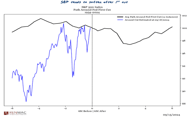
We relay this simply to give our clients a counterargument to another powerful narrative. Of course, by definition, half the observations making up an average are above the average. And the counter to this argument is also that while September is historically a rough month, the fourth quarter is historically the best quarter of the year for stock investors.
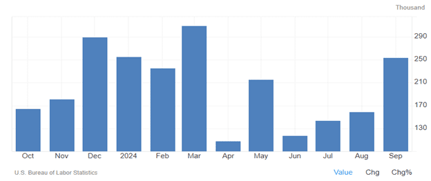
To confuse matters even further, economic releases since the start of October have been a mixed bag, and some stand in contrast to the previous three months (on which presumably the Fed based their decision). US non-Farm Payrolls for September surged to 254,000 jobs created (up from the disappointing 159,000 in August), and the unemployment rate fell to 4.1% (down 0.1% from August). We note that this NFP report includes a surge of 31,000 government jobs as well, reducing the “quality” somewhat in the eyes of many economists. Still—there is no denying it was a solid number and stands in contrast to the previous three months.
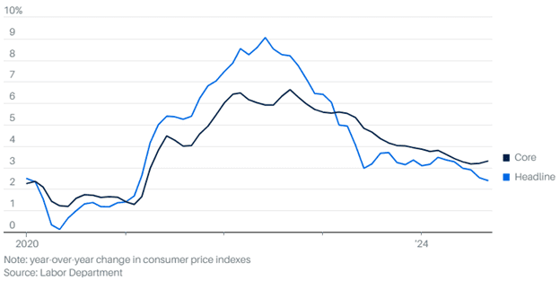
More recently, we also got a warmer than expected read on inflation—especially core inflation (ex-food and energy). Both the most recent labor and inflation reads now call into question the necessity of September’s 50-basis point move and have forecasters’ heads spinning about what to expect from the Fed in November and December.
Our interpretation of all this data, scattered though it may be, is that the economy is in fact feeling the effects (finally) of the 2022 series of significant rate hikes. That it has taken this long is consistent with Milton Friedman’s “long and variable lags” description of monetary policy as a blunt instrument. Rate cuts from last month and into the future will also have lagging effects on the economy, so we expect a slowing trend to continue. Hurricanes Helene and Milton will no doubt impact near-term economic metrics as well; first negatively (destruction and closure of businesses), then positively (the rebuilds).
Paying attention to the broadening out of US equity markets and the challenge for leadership among sectors rather than chasing the “AI” narrative is likely prudent, in our view. While we do not advise large shifts or reversals of strategy, taking some profits out of “hero” stocks/sectors may also be prudent.
Fixed Income:
CCR Wealth Management’s model portfolios have been firing on all cylinders this year, in no small part due to returns in bonds. While cash instrument returns of 5+% have been nice compared to the last decade and a half, they predictably have been trounced by the bond market over the last year (as illustrated by the broad Bloomberg Bond Index below).
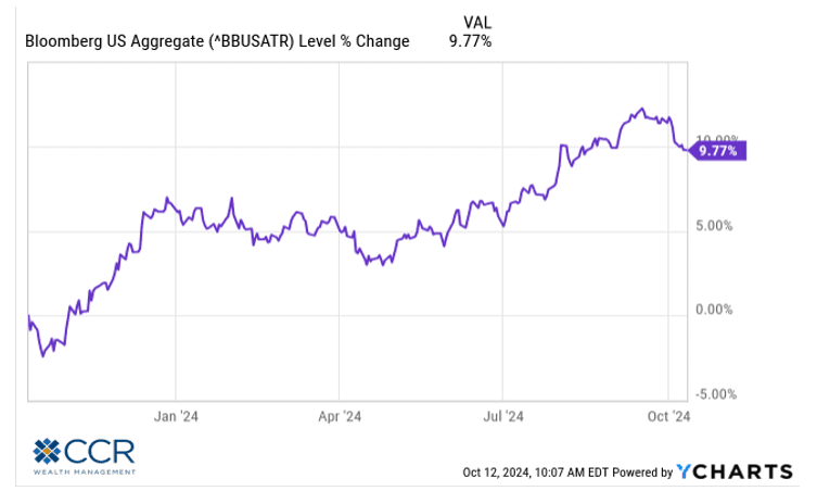
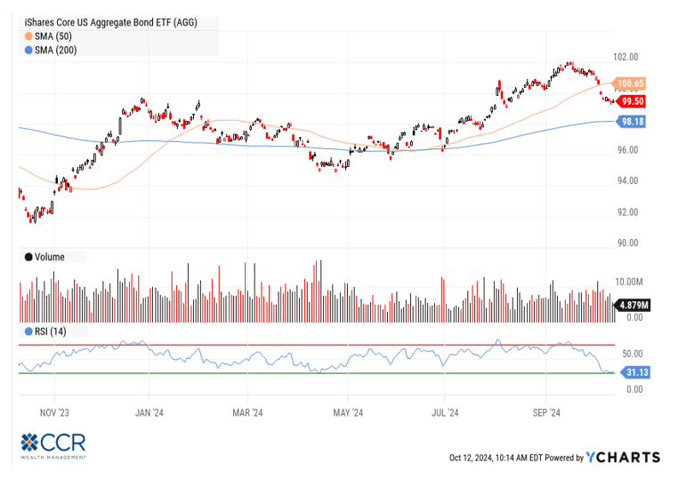
As we pointed out earlier in the year, the rate-cutting cycle will cut into cash rates, and we believe it will continue to benefit the bond market. Uncertainty around “when” and by “how much” the Fed’s cycle will proceed in the near term may cause a “two-step forward—one step back” pattern as we have seen during the last few weeks, but the technical trend should not be argued with!
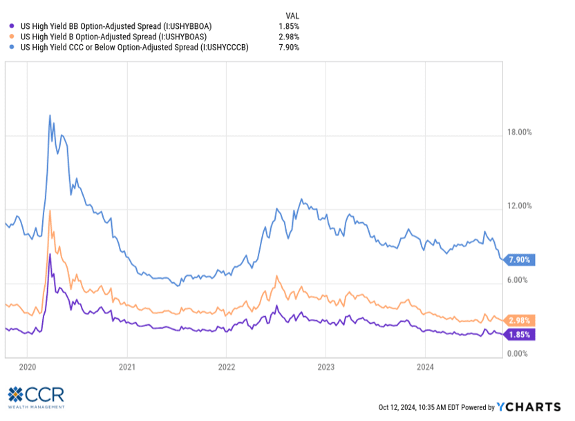
Within the bond market—which is carved into “sectors” like the broad equity markets, we continue to see most of the value in government-backed categories, including mortgages and municipals. While high-grade credit also seems solid to us, we remain concerned about the valuation of lower-grade credit (junk bonds, floating rate). We view all things through a “wealth management” lens and weigh the risk against the probable return. “Value” in credit bonds is measured in the yield spread versus a comparable Treasury maturity. As is plain in the nearby chart, the spreads in the BB, B and CCC rated credit markets remain near their 10-year (and indeed, all-time) lows. This is akin to stocks trading at all-time high P/E valuations. Much “hope” is baked into these prices (especially in a slowing economy), and we would like to see these spreads increase before adding any discrete high-yield elements to our portfolios beyond the emerging markets debt component that exists.
We conclude by once again acknowledging that this is an election year, and perhaps one of the strangest we have experienced—both in terms of the candidates and events that have unfolded since the Summer. It being October, perhaps another surprise may lie in wait yet. But our economy—and indeed our stock markets are robust mechanisms, more so than any other in the world. From a markets perspective we reiterate that as forward-looking mechanisms, trends persist. These trends should take precedence over emotionally generated imaginations should “your team” not win the game. In my 30 years in this field, over the course of seven Presidential election cycles (and hundreds of related client conversations), I have yet to encounter a politically motivated investment decision pan out as expected.
Follow us on social media for more timely content delivered directly to your news feed!
